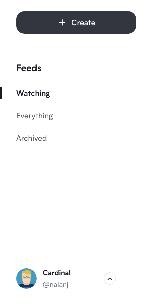
Card List Updates
Published March 8, 2021
We've been working since the preview launch two weeks ago to set up some UI improvements and bugfixes, and prepare the way for the upcoming saved searches release.
Card List UI Updates
In preparation for saved searches and some other improvements we have planned, and to generally improve the card list user interface, we've moved the create button to a more prominent position and made the account menu more obvious.

Data Loading Improvements
We noticed some small improvements we could make around data loading with the card list and general session info, so we rolled that out. It should yield smoother interactions in the app, especially when first logging in or starting a new session, and they should make our lives easier while building Cardinal.
Sign up for our monthly newsletter.